
Cluster Analysis Examples
Example 1: Bradford weather
The table contains a summary of Bradford's weather for February from 1982 to 1993. The variables are reasonably self-explanatory. Are there any obvious clusters, i.e. are there groups of years that shared similar February weather? The data can be downloaded as an Excel file or a plain text file.
| YEAR | Mean Temperature | Maximum Temperature | Minimum Temperature | Soil Temperature (@10cm) | Monthly rainfall (mm) | Maximum rain in a day | Days with snow |
|---|---|---|---|---|---|---|---|
| 1982 | 4.2 | 13.3 | -5.3 | 4.0 | 23 | 6 | 0 |
| 1983 | 1.0 | 7.8 | -5.3 | 3.0 | 34 | 11 | 8 |
| 1984 | 2.9 | 11.4 | -5.1 | 3.2 | 65 | 17 | 0 |
| 1985 | 1.6 | 10.2 | -6.0 | 2.9 | 7 | 2 | 5 |
| 1986 | -1.1 | 2.7 | -9.0 | 1.5 | 22 | 5 | 24 |
| 1987 | 3.3 | 13.4 | -7.3 | 2.7 | 46 | 15 | 2 |
| 1988 | 4.5 | 13.0 | -2.9 | 3.7 | 89 | 22 | 4 |
| 1989 | 5.7 | 13.5 | -2.7 | 5.2 | 92 | 16 | 0 |
| 1990 | 6.6 | 14.9 | -0.6 | 5.5 | 131 | 29 | 0 |
| 1991 | 1.5 | 13.8 | -7.2 | 2.6 | 80 | 18 | 14 |
| 1992 | 5.5 | 12.1 | -3.6 | 4.5 | 46 | 9 | 2 |
| 1993 | 4.7 | 12.0 | -3.0 | 5.1 | 14 | 6 | 0 |
The following three analyses illustrate how the selection of a method and a decision to standardise or not can have a large impact on our interpretation of the data.
Analysis 1
It is very difficult to see patterns in the raw data (see Table above). However, the dendrogram is a picture of one of the patterns (see below for three caveats). Take the first Bradford weather dendrogram as an example. Each case is labelled below with its year. The vertical access is similarity, where 100 = identical. Now examine the first 2 cases (1982 & 1993), they are joined by a vertical line that would intersect the distance axis at a value of approximately 99%. This indicates that these two years were very similar (see below) to each other, but not to other years. The same is true for the pairs 1987 & 1992 and 1988 & 1989 (see below).
1982 4.2 13.3 -5.3 4.0 23 6 0
1993 4.7 12.0 -3.0 5.1 14 6 0
1987 3.3 13.4 -7.3 2.7 46 15 2
1992 5.5 12.1 -3.6 4.5 46 9 2
1988 4.5 13.0 -2.9 3.7 89 22 4
1989 5.7 13.5 -2.7 5.2 92 16 0
Following the merger of those six cases into three clusters the next most similar pairing is between the cluster with cases (1982 & 1993) and case 1985. This is apparent because the vertical line joining these 3 cases intersects the distance axis at the next highest value (close to 99%).
The case which is most dissimilar to all others is 1990. This can be seen because it only merges with the other years at a relatively high dissimilarity of 89%.
There are two important caveats to remember about the
above explanation.
1. It applies only to the combination of distance measure and clustering algorithm
used in that analysis. If these are changed so will the dendrogram (see the
other examples).
2. The similarity axis does not have the real distances. Minitab has converted
them to a percentage similarity.
Nearest neighbour, squared euclidean distance, unstandardised variables
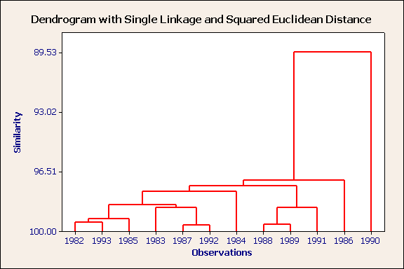
There is one obvious outlier. This is 1990, a wet month. There are three obvious clusters (1982,1993,1985), (1983,1987,1992) and (1988,1989,1991). Can you characterise these three groups from the raw data?
Analysis 2
Nearest neighbour, squared euclidean distance, standardised variables.
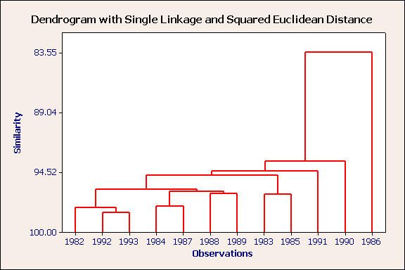
There are two outliers: the most severe is 1986 ~ a very cold month and 1990, a warm, wet month. 1982,1992 & 1993 form a compact cluster and these can be considered to be part of a larger cluster containing 1984,1987,1988 & 1989. 1983 & 1985 form a rather loose cluster.
Analysis 3
Furthest neighbour, squared euclidean distance, standardised variables.
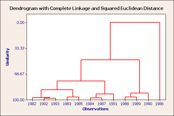
1986 is an outlier. The remaining years form three rather distinct clusters, of which the cluster containing 1988, 1989 & 1990 is the more unique. Again, using the table of raw data, can you characterise these three groups?
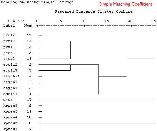
Example 2: Bacterial taxonomy
The following data are part of a data set described by Rataj & Schindler (1991, Binary, 3:159-164). Data are presented for six species, most having data for more than one strain and 16 phenotypic characters (0 = absent, 1 = present). The data can be downloaded as an Excel file or a plain text file.The species are:
- ecoli Escherichia coli
- styphi Salmonella typhi
- kpneu Klebsiella pneumoniae
- pvul Proteus vulgaris
- pmor P. morganii
- smar Serratia marcescens
In the following table 1 indicates a positive result.
| Species | H2S | MAN | LYS | IND | ORN | CIT | URE | ONP | VPT | INO | LIP | PHE | MAL | ADO | ARA | RHA |
|---|---|---|---|---|---|---|---|---|---|---|---|---|---|---|---|---|
| ecoli1 | 0 | 1 | 1 | 1 | 0 | 0 | 0 | 1 | 0 | 0 | 0 | 0 | 0 | 0 | 1 | 1 |
| ecoli2 | 0 | 1 | 0 | 1 | 1 | 0 | 0 | 1 | 0 | 0 | 0 | 0 | 0 | 0 | 1 | 0 |
| ecoli3 | 1 | 1 | 0 | 1 | 1 | 0 | 0 | 1 | 0 | 0 | 0 | 0 | 0 | 0 | 1 | 1 |
| styphi1 | 0 | 1 | 1 | 0 | 0 | 0 | 0 | 0 | 0 | 0 | 0 | 0 | 0 | 0 | 1 | 0 |
| styphi2 | 0 | 1 | 1 | 0 | 0 | 0 | 0 | 0 | 0 | 0 | 0 | 0 | 0 | 0 | 0 | 0 |
| styphi3 | 1 | 1 | 1 | 0 | 0 | 0 | 0 | 0 | 0 | 0 | 0 | 0 | 0 | 0 | 1 | 0 |
| kpneu1 | 0 | 1 | 1 | 1 | 0 | 1 | 1 | 1 | 1 | 1 | 0 | 0 | 0 | 1 | 1 | 1 |
| kpneu2 | 0 | 1 | 1 | 1 | 0 | 1 | 1 | 1 | 1 | 1 | 0 | 0 | 1 | 0 | 1 | 1 |
| kpneu3 | 0 | 1 | 1 | 1 | 0 | 1 | 1 | 1 | 1 | 1 | 0 | 0 | 1 | 1 | 1 | 1 |
| kpneu4 | 0 | 1 | 1 | 1 | 0 | 1 | 1 | 1 | 0 | 1 | 0 | 0 | 1 | 1 | 1 | 1 |
| kpneu5 | 0 | 1 | 1 | 1 | 0 | 1 | 0 | 1 | 1 | 1 | 0 | 0 | 1 | 1 | 1 | 1 |
| pvul1 | 1 | 0 | 0 | 1 | 0 | 1 | 1 | 0 | 0 | 0 | 0 | 1 | 0 | 0 | 0 | 0 |
| pvul2 | 1 | 0 | 0 | 1 | 0 | 0 | 0 | 0 | 0 | 0 | 0 | 1 | 0 | 0 | 0 | 0 |
| pvul3 | 1 | 0 | 0 | 1 | 0 | 0 | 1 | 0 | 0 | 0 | 0 | 1 | 0 | 0 | 0 | 0 |
| pmor1 | 0 | 0 | 1 | 1 | 1 | 0 | 1 | 0 | 0 | 0 | 0 | 1 | 0 | 0 | 0 | 0 |
| pmor2 | 0 | 0 | 0 | 1 | 1 | 0 | 0 | 0 | 0 | 0 | 0 | 1 | 0 | 0 | 0 | 0 |
| smar | 0 | 1 | 1 | 0 | 1 | 1 | 0 | 1 | 1 | 0 | 1 | 0 | 0 | 0 | 0 | 0 |
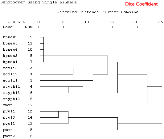
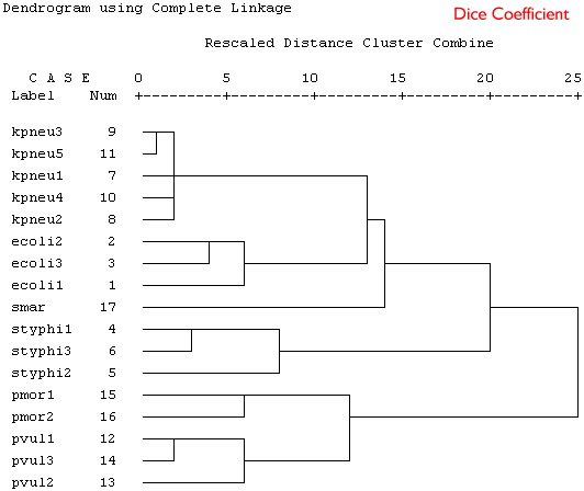
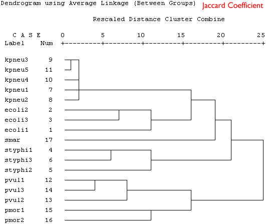
Because these are binary data a binary similarity measure was used for the clustering. In the four plots shown below a selection of similarity coefficients and clustering algorithms were applied. The dendrograms are the output for the cluster program in SPSS.
Produce a short series of notes that highlight the similarities and differences in the these dendrograms. Which is the best representation of the taxonomic structure?
 |
|---|
 |
 |
 |