
Introduction
If we have information about individuals, obtained from a number a variables, it is reasonable to ask if these variables can be used to define membership of a group. Discriminant Analysis works by combining variables in such a way that the differences between predefined groups are maximised.
Consider a simple two group example. The aim is to combine (weight) the variable scores in some way so that a single new composite variable, the discriminant score, is produced. One way of thinking about this is in terms of a recipe, changing the proportions (weights) of the ingredients will change the characteristics of the finished food.
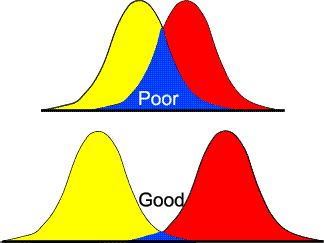
At the end of the process it is hoped that each group will have a normal distribution of discriminant scores; the degree of overlap between the discriminant score distributions can then be used as a measure of the success of the technique. For example:
The discriminant scores are calculated from a Discriminant Function which has the form:
D = w1Z1 + w2Z2 + w3Z3 + .... wiZi
where
- D = discriminant score;
- w i = weighting (coefficient) for variable i;
- Z i = standardised score for variable i (a standardised variable has a mean of 0 and a standard deviation of 1).
Consequently a discriminant score is a weighted linear combination (sum) of the discriminating variables or predictors.
Standardising the predictors ensures that any scale differences between them are eliminated. Once standardised, absolute weights (i.e. ignore the sign) be used to rank predictors in terms of their discriminating power, the largest weight being associated with the most powerful discriminating predictor. Predictors with large weights are those which contribute most to differentiating the groups.
[Continuing the recipe metaphor.... The quality of the finished meal is very dependent on getting the proportions correct. However, absolute quantities are not a good guide to their contribution to the overall taste since the ingredients may have different inherent strengths (e.g. compare garlic and onion). Standardising predictors removes this effect .]
Graphical explanation
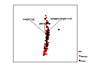
As with most other multivariate methods it is possible to present a pictorial explanation of the technique. The following example uses a very simple data set, 2 groups and 2 variables. If scatter graphs are plotted for scores against the two variables the above is obtained.
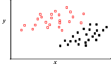
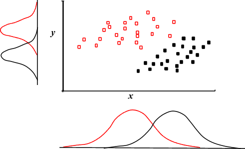
Clearly the two groups can be separated by these two variables, but there is a large amount of overlap on each single axis (although the y variable is the 'better' discriminator). It is possible to construct a new axis which passes through the two group centroids ('means'), such that the groups do not overlap on the new axis.
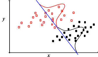
The new axis represents a new variable which is a linear combination of x and y, i.e. it is a discriminant score. Obviously, with more than 2 groups or variables this graphical method becomes impossible. However, animation can demonstrate how some projections of data are able to separate data better than others.
It is possible to construct axes through n-dimensional (where n is 2 or more) space. This means that more than two variables and/or groups can be used. The mathematical basis of the method is summarised in the next section.
![]() Back to Discriminant Analysis
Back to Discriminant Analysis
![]() Next page (Mathematical Description)
Next page (Mathematical Description)